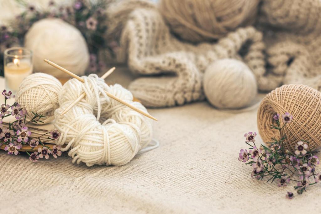
Finding Calm in The Color Palette of Scandinavian Art Therapy Decor

Nordic Light, Gentle Hues: Foundations of Healing Color

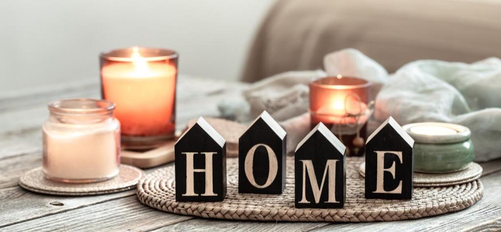
Off-whites, warm creams, and greige act like deep, steady breaths for a room, lowering visual noise and settling the nervous system. In Scandinavian art therapy decor, these neutrals anchor the space so accent tones can tell the story without overwhelming. Which neutral would you keep if you could choose only one?

Nordic Light, Gentle Hues: Foundations of Healing Color

Low, silvery northern light softens edges and favors matte finishes, allowing colors to bloom gently across the day. This light invites tender transitions—from dawn pearl to dusk slate—so rooms feel restorative rather than dramatic. Try observing how your wall color changes hourly, and comment with your favorite moment.
Blonde Woods with Honey Undertones
Ash and oak carry subtle golden notes that soften whites and cool grays, creating a sunlit base even on cloudy days. Their grain adds visual rhythm without loud contrast, easing overstimulation. Post a snapshot of your favorite wood tone, and we will suggest companion neutrals that fit its warmth.
Textiles that Whisper, Not Shout
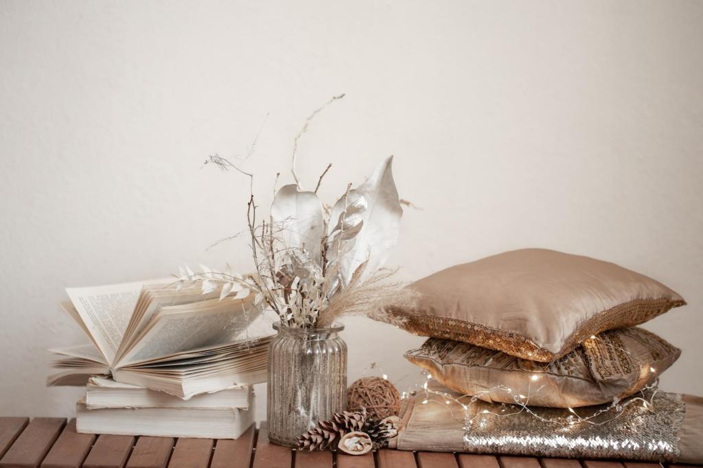
Wool throws, linen curtains, and cotton knits layer similar shades to build depth without harshness. The tactile comfort supports art therapy practices like mindful touch and sensory grounding. Consider swapping one bright cushion for a textured neutral and notice how the room exhales—then tell us how it felt.
Stone, Clay, and Matte Ceramics
Soapstone grays, clay blush, and chalky ceramics carry earth’s calm palette into daily rituals—tea, journaling, slow breakfasts. Matte finishes diffuse glare, guiding tired eyes toward softness. Share your go-to mug color and we will recommend a complementary wall tone inspired by Nordic shorelines.

Psychology of Scandinavian Tones

Soft slate and sea-glass blues echo distant waters and open skies, inviting longer exhales and measured thoughts. In therapy-informed rooms, these blues create mental spaciousness without feeling cold. Pair with warm oak or linen to keep the mood human, then share your favorite blue memory in the comments.

Psychology of Scandinavian Tones

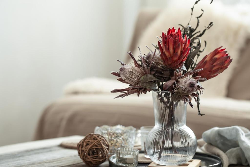
Muted greens, like lichen and pine, stabilize the palette and body, signaling safety and continuity. Their low saturation encourages steady attention and gentle presence. Add a moss cushion or artwork, notice your shoulders drop, and tell us where your gaze naturally settles afterward.
Living Room: Social Calm
Walls: soft ivory. Wood: light oak. Textiles: charcoal wool, flax linen, and a dusty-blue throw for conversational ease. Add clay accents to warm the edges without clutter. Post a photo of your current living room, and we’ll suggest a two-step color tweak that amplifies connection.
Bedroom: Restorative Cocoon
Walls: warm greige. Bedding: linen in mushroom and shell tones. Accent: a moss-green cushion or watercolor print to cue sleepiness. Dim, layered lighting preserves the palette’s softness. Try this combo for a week and comment on sleep quality, dreams, and morning mood shifts.
Workspace: Focused Minimalism
Walls: pale mist gray to reduce glare. Desk: blonde wood for warmth. Accents: fjord blue organizer and matte ceramic pen cup. Keep visual anchors few and purposeful. What task do you most avoid? Share it, and we’ll recommend a micro-palette nudge that supports sustained attention.
Lean into layered whites, pearl grays, and beeswax ambers to counter long nights with gentle luminosity. Candlelight energizes warm undertones, preventing cool palettes from feeling sterile. Try a winter tray with clay, brass, and cream ceramics; subscribe for our seasonal palette checklist delivered before the solstice.
Introduce pale leaf greens and the faintest robin’s-egg blue, grounded by linen neutrals. These cues signal renewal without overwhelming senses emerging from winter quiet. Swap one accessory per week and track mood shifts in a color journal—then share your findings with our community.
Blend soft ochre, blueberry gray, and oak to echo forests and evening lakes. This combination steadies transitions back to routine while honoring lingering light. Add a terracotta bowl and wool throw; tell us which tone makes your home feel most like a sanctuary right now.

Stories from the North: Healing with Hues

A reader replaced chaotic brights with ivory walls, oak shelving, and fjord-blue accents. She reported fewer evening headaches and a return to sketching after dinner. The palette quieted the room enough to hear her own thoughts. Have you felt a similar shift? Share your turning point.

Stories from the North: Healing with Hues

One art therapist logs daily mood alongside palette notes—fog gray on heavy mornings, lichen green on grounding days. Over months, patterns emerge that inform micro-adjustments at home. Start a seven-day color log and comment with one surprising association you discovered.

Build Your Own Scandinavian Therapy Palette

Collect three photos from a park, coast, or windowsill. Note undertones—honey, slate, lichen—and the feelings they spark. Let memory guide selection as much as aesthetics. Share your trio and we’ll help identify anchors and accents drawn from your lived landscape.
Raynhart
Privacy Overview

This website uses cookies so that we can provide you with the best user experience possible. Cookie information is stored in your browser and performs functions such as recognising you when you return to our website and helping our team to understand which sections of the website you find most interesting and useful.